Since Ryan Cohen’s tech centric takeover, GameStop.com has faced constant updates in pursuit of e-commerce perfection.
Back in March of 2021, after over two decades of GameStop’s classic pure black and dark red logo, the company’s website was updated to feature all red lettering, seemingly putting the past behind them.
Following this update in June 2021, GMEdd took note of GameStop refreshing their corporate branding to a sleek black and white, a bold new look for the aspiring tech company’s digital presence.

Two months into Cohen’s entrance GameStop tried going all red.
Now What?
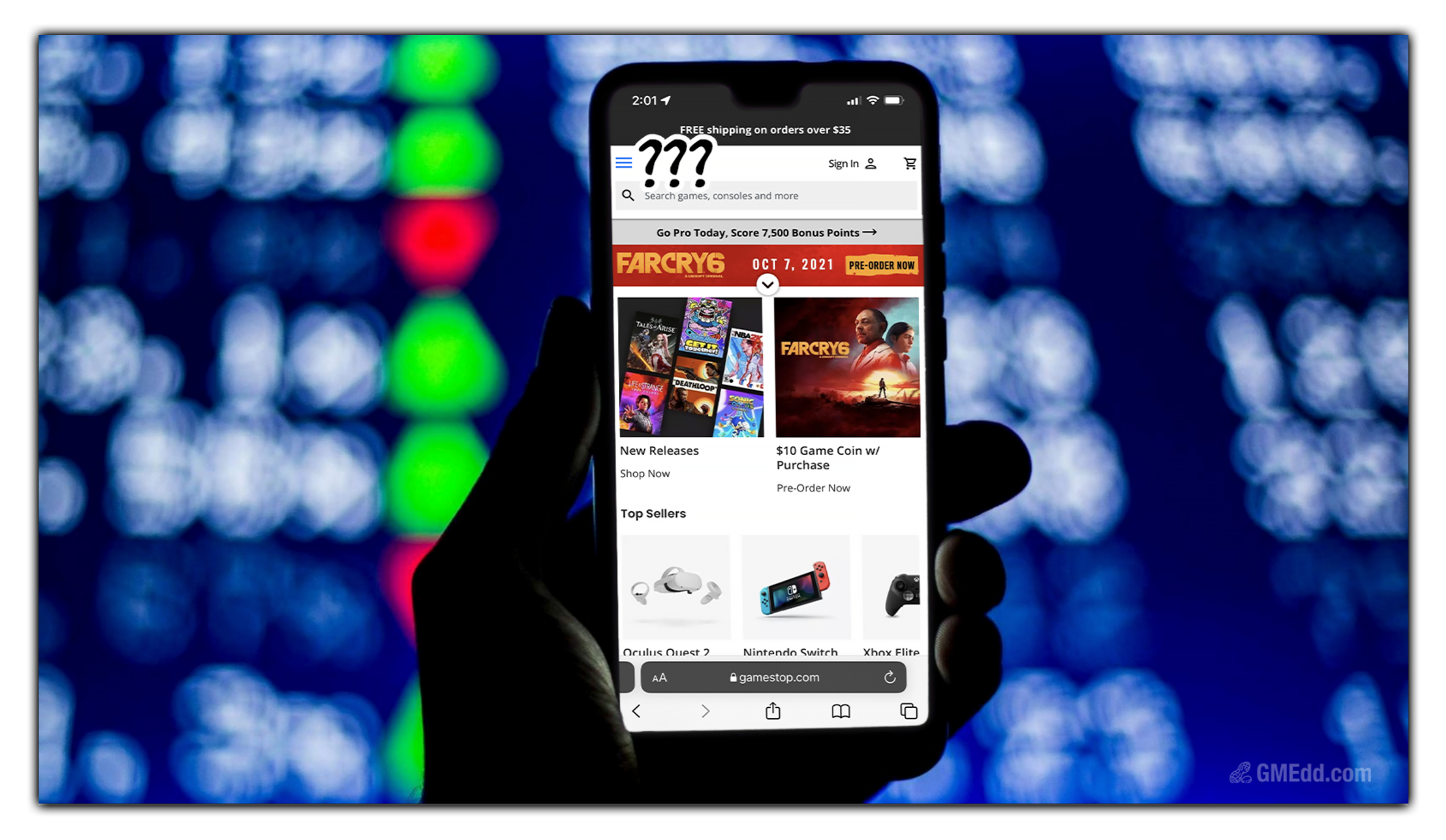
Within the past week, GameStop has updated its website logo, again, but not to their black and white logo from June, to something new we’ve never seen before.
![]()
The GameStop logo remained largely unchanged from 2000 until now.
Now, the logo is back to its original black and red, but the exact colors used are different. The red letters are now a more subdued shade of red, and the black letters are in a lighter shade of black.
The logo’s signature Impact font is also notably modernized, featuring curved edges in exchange for the old sharp lines.
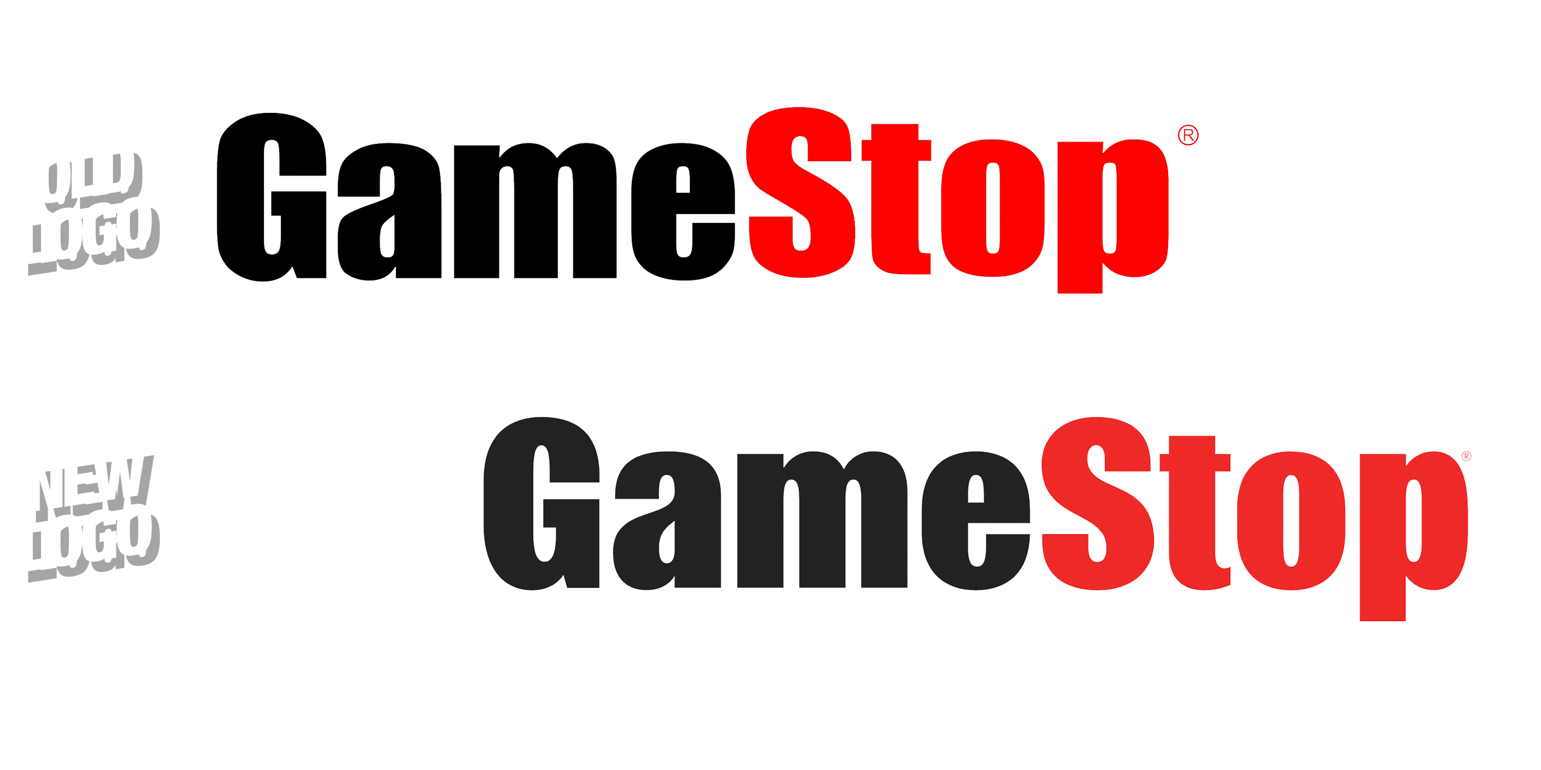
Sharp lines are out, curvy is in.
We can’t help but take note that there’s another certain e-commerce giant with a very curvy logo, all the way from a to z.
Updates Across the Board
The logo change isn’t the only fresh look on the website.
GameStop.com’s digital storefront has gone through several major overhauls since Cohen took over and it’s likely we will continue to see incremental changes to the platform.
GameStop’s Investor Relations page has also undergone a significant update, introducing new branding with refreshed font, and fun gaming-related banners.
It is as if they’re trying to appeal to a new kind of investor.
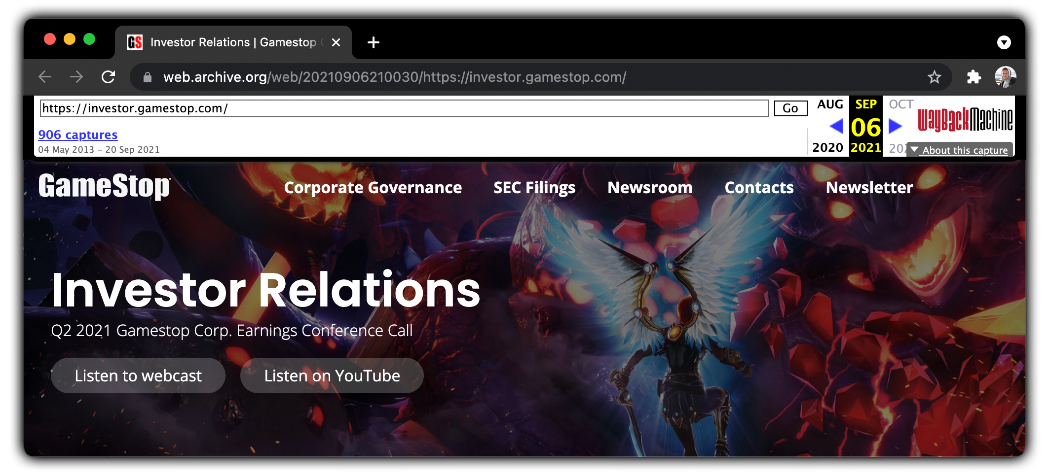
GameStop’s new board pushed for an update to their investor relations pages.
The update to GameStop’s investor relations appeared on September 6th, 2021, shortly before GameStop’s Q2 2021 Earnings announcement.
The branding seen in this section of their site matches that of the job listing posts by GameStop on LinkedIn that started about a month ago.

GameStop’s branding is facing refreshes in all departments.
GMEdd’s Tech Hires sheet details over 180 tech-related hires since RC Ventures’ January takeover, including new designers and graphic artists.
Pixel by pixel, GameStop must implement both subtle and powerful changes, while retaining the retail giant’s distinguished look that gamers across the world have resonated with for over twenty years.
Jenna and Toast wrote this article exclusively for GMEdd, Toast edited
Sources: Wayback Machine, Wayback Machine, GameStop.com, GameStop on LinkedIn
Gilberto says:
Great update, never would have noticed if not for GMEDD
Dalton says:
Lots of new products on the site too.